PLACEMENT / SCALE / SEQUENCE
How to hang
a triptych without
losing the room.
A three-part work needs enough space to breathe, but not so much that it becomes three unrelated pictures.
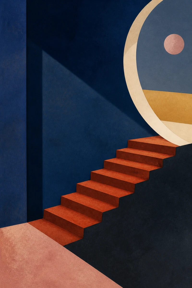
Start with the total width.
Three prints occupy more wall than their listed size suggests. The gaps matter. So do the frames.
Measure the usable wall, then decide how much quiet space you want to leave around the complete composition. The figures below describe the artwork and suggested gaps only. Add the visible width of your frames to calculate the final installed span.
| Each print | Gap between prints | Art-only span | Character |
|---|---|---|---|
| 12 × 18 in | 2 in | 40 in | Tight and connected |
| 12 × 18 in | 3 in | 42 in | WATISART recommendation |
| 12 × 18 in | 4 in | 44 in | Airier and more separate |
The opening edition is offered in one size: three 12 × 18-inch prints. The table changes only the spacing between them; frame widths add to every span.
Try it in paper first.
Cut three paper rectangles to the outside dimensions of your intended frames. Tape them to the wall with low-tack painter’s tape. Step back. Sit down. Walk into the room the way you usually do.
The right arrangement should read as one passage from the doorway, then reveal three separate rooms as you come closer.
Keep the works in order.
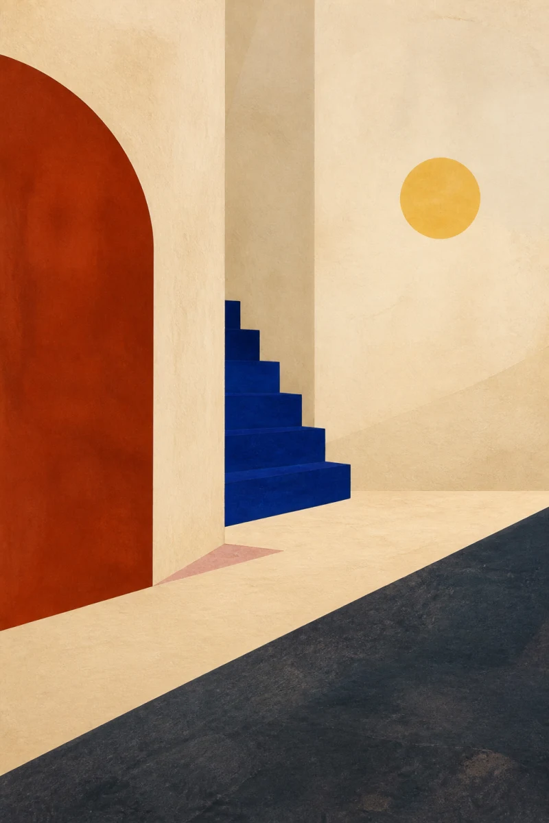
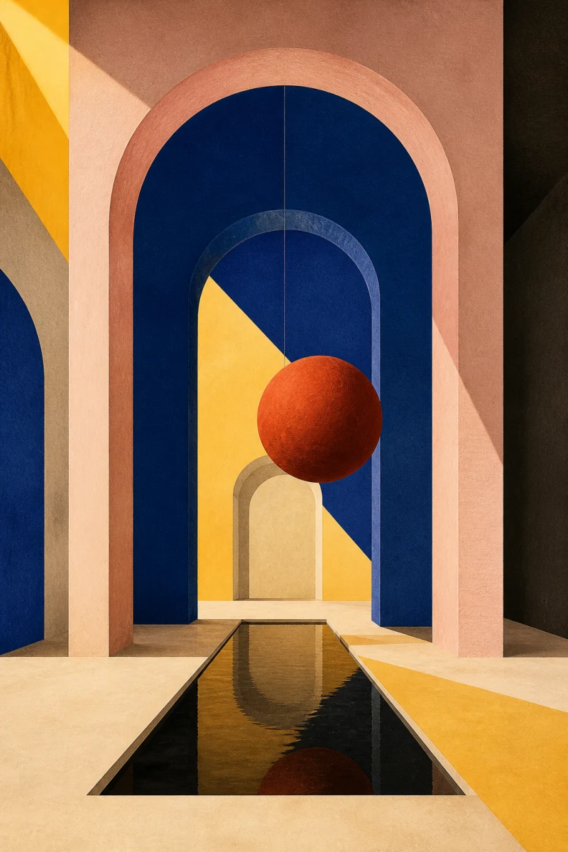
Three Rooms of Light moves left to right: Warmth, Stillness, Opening. Room II is the visual hinge, not simply the middle print. Give all three works the same gap so the blue interior can hold the passage together.
Use the furniture as your guide.
Above a console, bed, or sideboard, compose the triptych with the furniture rather than treating the wall as an empty grid. Start with the center of the complete group near the height that feels natural from the room’s main viewing position. Then adjust for the furniture, ceiling, and sightline.
If the work feels stranded, bring it closer to the furniture. If it feels crowded, tighten the gaps slightly or test a wider field of wall around the set.
Choose one frame treatment.
The artwork runs to the edge without a printed border. A narrow frame keeps the three images visually connected. A mat introduces more silence, but it also increases the total span. Use the same frame and mat treatment for all three works.
Frames shown in future room images will be placement examples unless a product page explicitly says otherwise.
Check the room’s light.
Paper reflects room light, so the work will feel different from a glowing screen. Before hanging, look at the wall in morning light, evening light, and with the lamps you actually use. Avoid a position where constant glare erases the dark blues or where direct moisture can reach the paper.
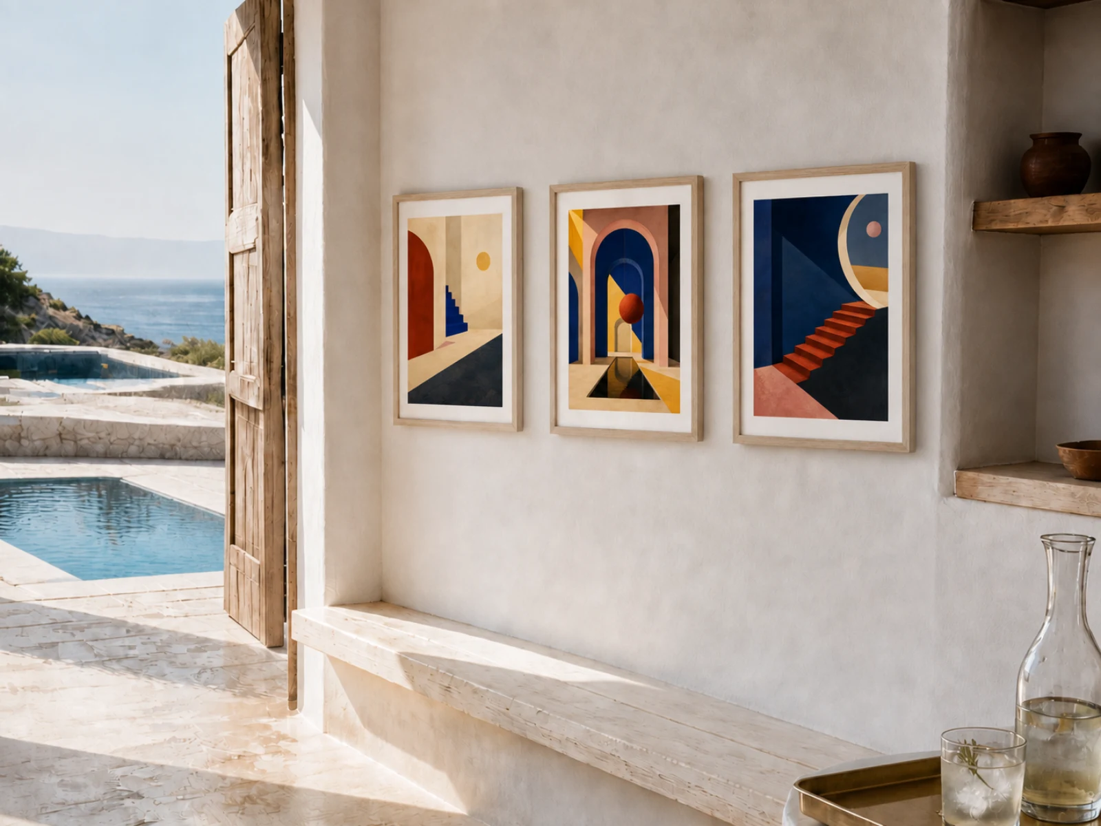
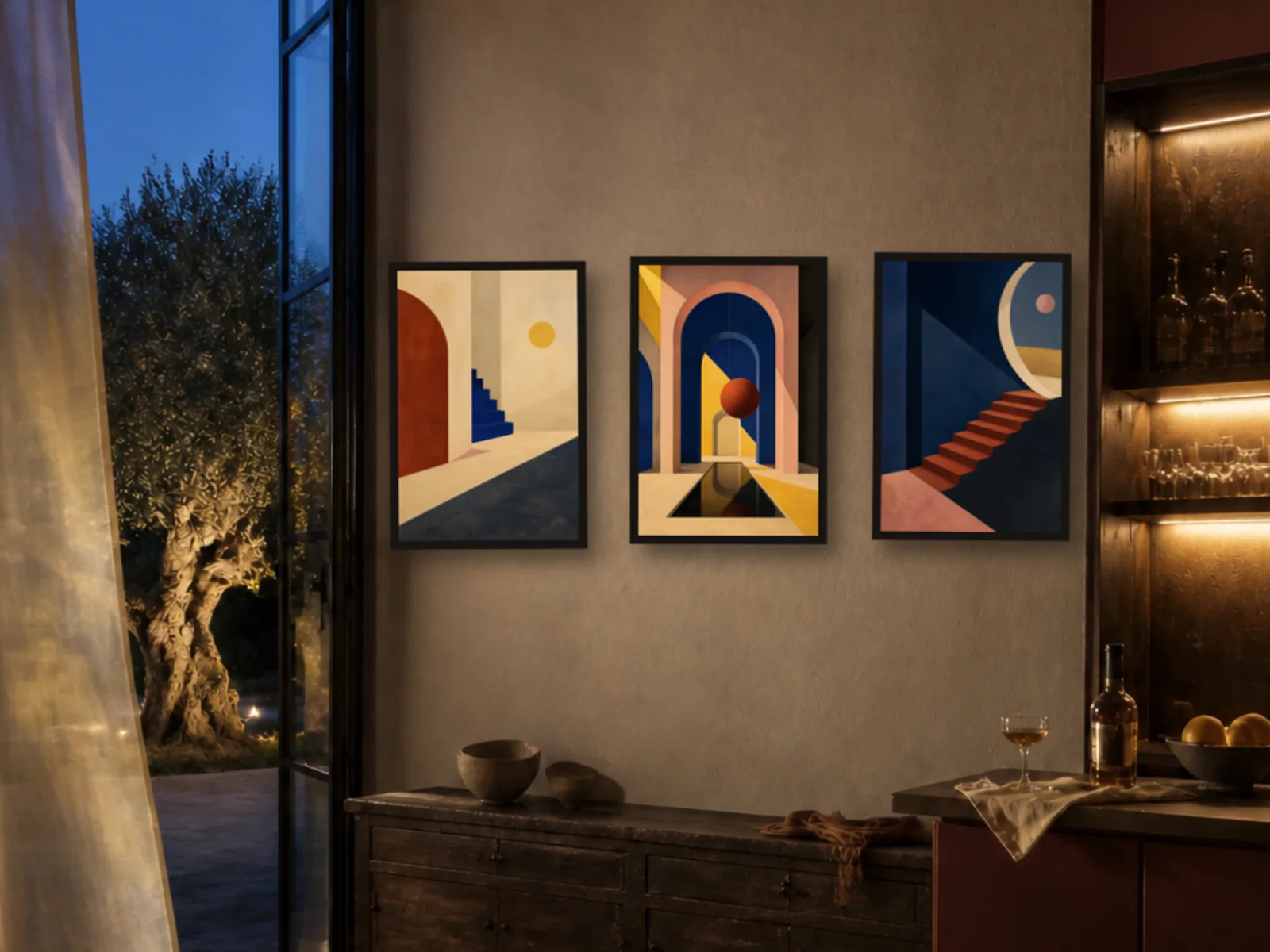
ROOM IDEAS / TWO MOODS
See it on
the wall.
These AI-assisted digital mockups show two ways the complete set might live in a room. They are placement ideas, not photographs of the physical prints. Frames and mats are not included.